
Tutorials
Breaking down your Statistics in Compass AI
Explore Compass AI's statistics page, which offers an in-depth view into all of your inflows and outflows, as well as individual transactions.
October 31, 2025
4 min read
Your Statistics page gives you a comprehensive view of all financial activity in your business. By organizing inflows and outflows into clear categories, you can see exactly where money is coming from and where it's going, without digging through individual transactions or endlessly appending a spreadsheet.
What You'll See on the Statistics Page
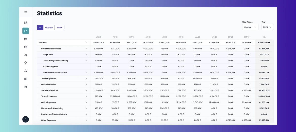
The statistics page displays three main views: All transactions, Inflows only, and Outflows only. You can switch between these views using the filter buttons at the top of the page. Each view breaks down your financial data by category, making it easy to spot trends and identify your biggest revenue sources or expense areas.
Your statistics page depends on properly configured categories to an extent. If you haven't set up your categories yet, we recommend reviewing our guide on category setup before diving into your statistics. Well-organized categories ensure your financial data is well-aligned, organized and that it tells the right story.
The statistics page includes two options for customizing how you view your data:
- View Range: Allows for switching between monthly and quarterly views to see your data at different levels of detail. Monthly views help you track short-term changes, while quarterly views make it easier to spot broader trends.
- Year Selection: Choose which year you want to analyze. This is particularly useful when comparing performance across different periods or preparing annual reports.
Deep-dive into specific Statistics & Categories
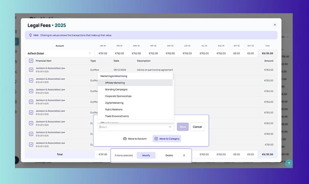
Each category row can be expanded to reveal increasing levels of detail.
This hierarchical structure lets you move from high-level overviews to specific transactions in just a few clicks.
The first level of information is what you see when you enter the statistics page, this includes the total overall amount, as well as the total amount for each category.
For example, clicking Outflows might show categories like Software Services, Marketing, Salaries, and Office Expenses, displaying the total transactional values for each.
The second level of information consists of specific subcategories. To put this into perspective, clicking Software Services reveals subcategories like Communication Tools, CRM, Design & Creativity Tools, Development Tools, Cloud & Storage Services, and Collaboration & Productivity Tools.
The third level shows specific transactions for specific customers & vendors. So something that is stored under Communication Tools has multiple accounts, like Zoom and Slack, with each storing all the specific transactions that make up that subcategory. Each transaction as part of a customer/vendor displays the amount, description and corresponding date. They can also be bulk edited by selecting multiple transactions and choosing whether to move them to a different customer or category.
This top-down approach makes it easy to manage your finances at a glance, but it also allows you to get to know your business better by diving into the specifics of each category.